I’m getting to the point of making a character generator for my RC6502, and that means deciding on some things like the size of the character matrix. Googling comes up with a lot of “make your Mac terminal emulator pretend it’s a phosphor display” type things, but I’m not finding a lot about actual screen fonts from (say) 1975 - 1985 (or so).
So, do you have a favorite (or favorites) font from the age of 8-bit micros? What ones have stood the test of time (or you wish they had) and why?
No surprise, perhaps, I find I like Acorn’s most! But perhaps really because it’s the one that’s most familiar to me. A second favourite might be Amstrad’s. But it might be that the colour choices are influencing me,
You should check the fonts of the (text adventure) games (including handwriting fonts).
I think, I don’t have a favorite 6502 font. Maybe the vic-20 one, but has an uncommon aspect ratio.
To me the worst pictured is the Sinclair one.
I don’t like the bold ones, although that’s mainly the Commodore ones.
I prefer the Apple one. But maybe it depends on color and screen size.
Also funny the 80 columns fonts.
Edit: Should have mentioned, the script comes at 75K unoptimized, and, since it doesn’t use any fancy JS constructs, it should be easy to port to other languages (like C). There’s also an undocumented method for rotating glyphs by increments of 90°.
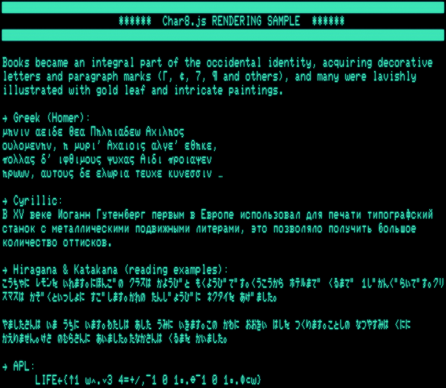
This was originally made for a web project with the intention of “throwing” any Unicode text (as found on various web services) at it and getting something meaningful back for display in a retro-style console application. I’d be happy, if it finds some use in special emulator, or similar (what about a 8-bit web browser or a web proxy returning graphics?). Also, you my harvest the glyph data for anything that may be useful to you.
Just a thought, Amstrad’s PCW font ought to be good, as it’s a word processor… and I see
The Amstrad PCW font is almost identical to the CPC with a few minor changes to O, Q, 0, h. As the PCW pixels were rectangular, stretching the height 2x will give the best effect.
I’m surprised at how much variation there is! I am planning to use a CRT - my target is an 8-inch Sony PVM that takes an NTSC composite signal. That means at 80 columns
the characters will be pretty small! It seems like the systems designed to run on TVs favor blockier / bolder letterforms.
Acorn’s font is very nearly readable in 80 column mode on my 5" Sony TV - and that’s through a UHF modulator. (There’s a reason the uprights in that font are two pixels wide.)
Other than that good reason I’ve always found 8 pixel wide fonts to be somewhat “awkward” unless you extend them to 10 lines tall - although saying that I do use Acorns (with a few of my own tweaks) font for a lot of my own retro projects.
The last time I made a retro font from scratch as for the Apple II - which didn’t have lower case until the //e series came out. It’s screen font is essentially 7 wide by 8 tall - I shifted the characters up a pixel and applied my own tweaks as well as add in the lower case characters. That pixel move up allowed me to have a one-pixel descender on some of the lower case letters and I felt that 7 pixels wide looked nicer - although at that time I had “proper” monitors for the Apple II’s I was using rather than TV sets…
This is also what some of the historical symbol generators on classic machines did. E.g., the data format for the symbol generator (both software and hardware versions) for the PDP-1 had a special bit that encoded a drop of the 7x5 rendering box by 2 lines to draw glyphs with descenders. I guess, there were others which did this as well.
(Note the serif or hook at the descender of “q”, frequently found in older screen fonts, including some of the 8-bit fonts.)
Historical note: The character set (not the glyphs, I guess, but could be as well) was designed by Ed Fredkin. (Mind the omission of the exclamation mark, colon and semicolon in favor of logical symbols.)
I believe the PDP-6/10 Type 340 character generator also did the drop. Screenshots demonstrate descenders going below the baseline. But there’s no evidence for this in manuals or schematics.
I do like to see real descenders - there’s only so much you can do in 8x8 even with non-square pixels. Acorn’s Beeb series do offer some screen modes where the 8x8 is augmented by blank lines, to make a perhaps more readable 8x9.
It might not quite address the question of a favourite font from the age of 8-bit micros, but DEC’s terminals were very readable - see @NoLand’s post elsewhere:
Perhaps the dot-stretching here is not totally unrelated to the 2d infill in teletext and Acorn’s Mode 7 - Mullard’s SAA5050 chip being the responsible party.
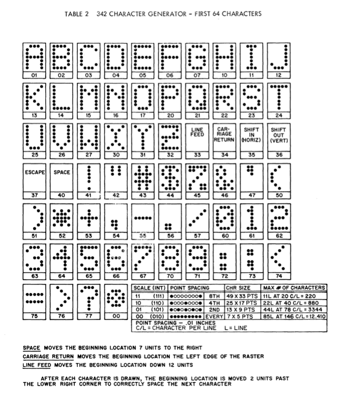
Here’s a screenshot of the character dump in the manual, which shows only upper-case characters (the simh emulation encodes just the first 64 characters, as well). I suppose, lower-case was just a copy of upper-case?
Mind that this is the Type 342 character generator for the 340, which seems to use hard-coded glyph data, but there may have been software solutions, as well, just like for the PDP-1 + Type 30 display (and these may have reused some of the logic and even the data.) – Maybe, there’s something related on the DECUS archives?
P.S.: Mind that this character set includes all the characters missing on the PDP-1.
An interesting feature is the missing dot of the question mark (which may be another indication for there being no lower-case glyphs at all.)
No, lower case was an optional additional 64 characters. And those are not documented anywhere. All we have are some screenshots, and things we can infer from MIT AI lab source code.
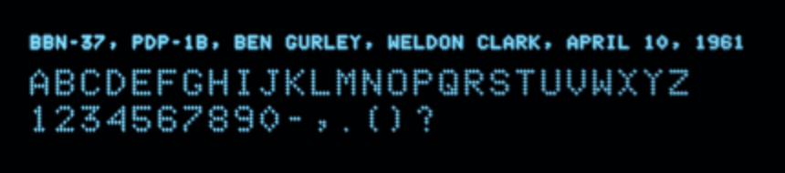
So … here’s a rendering sample of the font for the PDP-1b (at BBN) by Ben Gurley, Weldon Clark, April 10, 1961 (5 × 7 matrix), using the “Consolidated III” character set (as installed on the PDP-1B console typewriter on Apr. 7, 1961):
This may be the very first screen font for a commercial computer.
There are no lower-case characters, while special characters are spread over both the lower-case and upper-case ranges. Characters are rendered at arbitrary size (dot-pitch). The rendering routine works just like the console typewriter, supporting carriage return, backspace and even tabs. However, there’s only one case per key, upper-case for letter keys, lower-case for number keys, and mixed encoding for special keys. (Case-shift and color-shift are ignored.)
Thanks for that article @EdS, that’s great! I’m liking these PDP-1 fonts. I was planning to do an 8 x 10 or 8 x 12 matrix - my PVM has 250 lines, so 80 x 25 or 80 x 24 should be no problem.
Interestingly, there seems to be a direct linage from the Gurley-Clark BBN-37 font for the PDP-1b (1961) to the VT-100 font. The character matrix differs in dimensions, but most of the glyphs are close.
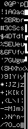
I can’t remember where I found it, but I have a font called A2Like which looks just like the font from the old Apple // computers. I remember that the guy who gave it to me said he used it in his Apple // paper newsletter and got compliments on how clearly the font showed up in it. Apparently, someone thought he was still writing it on an actual Apple //.
