Is there a demand for better diagrams to visualize how addressing modes work? The boxes in “Programming the 65816” by Eyes & Litchy are difficult for me to read because of the tiny font size and faded ink. Would anyone be interested in putting together improved diagrams?
1 Like
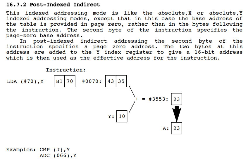
There is a nice set of diagrams in the Acorn Atom manual (Atomic Theory and Practice)
Here’s an example:
Here’s a link to the full manual.
https://archive.org/1/items/atomic_theory_and_practice/ATAP_Hoglet_20220811-V3.pdf#page=122
The diagrams start on page 118.
This helped me learn the 6502 just over 40 years ago.
Dave
There’s a pretty good scan of “Programming the 65816” on the internet archive. You can zoom all you need to: Programming the 65816 : Eyes, David : Free Download, Borrow, and Streaming : Internet Archive
The PDF is a rather large download, and of late, I’ve found some of the archive.org PDFs won’t open properly.
Thanks, those are easier to see than the diagrams in my paper copy of Eyes & Litchy. But, I think it would be easier to understand the summation if the Y: block containing “10” was directly below the “43” like in gradeschool addition because that is the block Y is being added to. The “endianness swap” you need to do to write the sum correctly with the # prefix is obscured too, so I think there is still room for improvement with these visualizations.
This is great, I’ve added a variation of this (standard notation, my own explanations, also some more diagrams) to my 6502 instruction set sheet:
(Hand-coded SVGs… ![]() )
)
I actually noticed this myself and tried to remedy this, but it is more a distraction (caused by the asymmetry and the inconsistency of the diagrams) than helpful.
Compare:

So I ended up using the original layout. (In the end, there is now way around wrapping your mind around endianness, and it may be even harder to grasp this, if the rest of the diagrams is introducing further irritations.)
1 Like