PDP-1, 7, 11 Fonts

Hi all:

I am trying to find a PDP-1 font to use while teaching. I love to change things up on the students and show them ‘old school’ tech when I demo command line and other on screen examples.

My Google-foo has failed me thus far in finding a PDP-1, 7, or 11 font I can use on my Mac. Any assistance is greatly appreciated.

Cheers

Mark

1 Like

I can only answer for the PDP-1:
Essentially, there are no fonts. The PDP-1 is a bare metal machine with a x/y display.
Meaning, any fonts are (originally) generated by a software renderer, dot by dot. There are actually several of these, and they rely on glyph data (two 18-bit words per character) for drawing the characters. There was also a symbol generator (Type 33), which used the same mechanism and data format (this came from memory and was thus freely configurable) as some as these font renderers, but at considerably higher speed.
All of these fonts (at least, all I know of) use a 7 lines by 5 dots matrix for the characters and may be scaled to a variable dot-pitch.

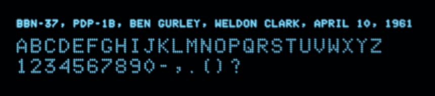
This is the earliest one I know, from 1961 for the PDP-1b production prototype at BBN:

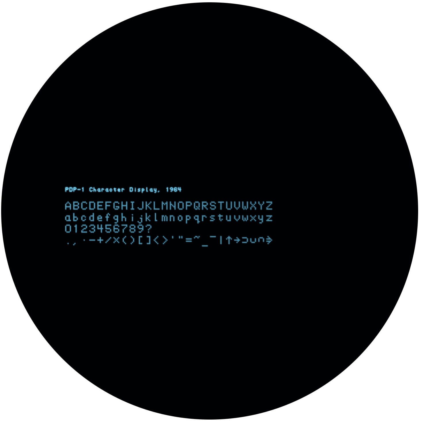
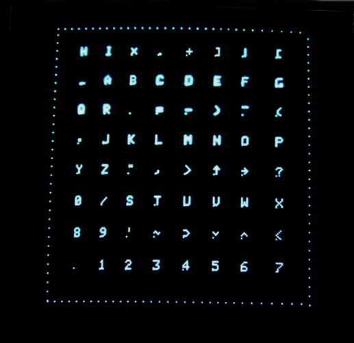
And here is another one, from 1964:


(This one bit to encode a possible drop by 2 lines to draw lower-case letters with descenders.)

Both images are emulation screenshots (compare the splash screen here, click the tiny black button in the bottom right corner of the emulated screen for a service screen including a font sample). There are also two images of the “real thing” in the CHM catalog (probably using the Type 33 Symbol Generator, since the restored PDP-1 at the CHM has one), using similar font data (there are differences in the logical symbols) as in the second picture (once in the dark, once in room lighting):

dec.pdp-1.chm_pdp-1_restoration_type_30_display_of_characters.2005.102663947.lg
(https://www.computerhistory.org/collections/catalog/102663947)

dec.pdp-1.chm_pdp-1_restoration_type_30_display_in_alignment.2005.102663948.lg
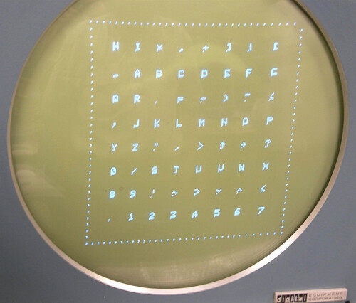
(https://www.computerhistory.org/collections/catalog/102663948)

(There’s apparently an extra dot for reference at the bottom left corner of the character matrix in those images. Or, as these photos were taken during the restoration process, this may be an artifact caused by some failure in the Type 33 Symbol Generator.)

It should be fairly easy to recreate those fonts in any font creator, even the simplest one. Mind that the font is composed of round dots, as this is an x/y point plotting display (plotting graphics by separate dots, one at a time). The resolution is 1024 x 1024 on a 9 3/8 x 9 3/8 inch display, but dots are larger than the distance between plotting locations (providing a visual resolution of roughly 512 x 512) and dot sizes vary with intensification (there are 8 levels of intensity).
(The first two images are rendered at a pitch of 2 for the small type and 4 for the character samples. But this only emulation based on what I see on photographs. The photos of the PDP-1 at CHM were probably taken with a smart phone and tend to show some bleeding artifacts due to exposure timing, capturing multiple [machine] frames at once.)

P.S.: The bar/over-stroke is used by the PDP-1 Macro assembler to designate assembler variables and should be a dead key character. For a true PDP-1 font, over-stroke variants should be available for every character.


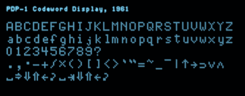
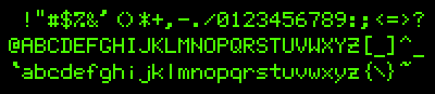
Edit/Update: I found another one, a rendering routine “Codeword Display” found in a collection of subroutines from 1961. This one features lower and upper-case characters as well as symbols for non-printable control characters:


(This is actually my least favorite one.)
The control symbols are (last row, left to right) space, tab, to-lower-case, to-upper-case, backspace, carriage return, followed by the same in upper-case (upper-case tab is actually different from its lower-case countepart)…

Notably, each of those 3 character routines uses a unique encoding for the character data, while the broader schemes are generally similar.

3 Likes

The PDP-11 never had much in the way of built-in terminal hardware, it typically depended on external serial terminals. From DEC, the most popular of these would have been the DECwriter line of printing terminals (likely the DECwriter II and IV?), which are dot matrix printers, and the VT52 and VT100 series of video terminals. You should be able to find TrueType or OpenType versions of the latter, I believe cool-retro-term has or recommends one.

Many other terminals were used with the PDP-11 in significant numbers; the Teletype Model 33 is famous for being a popular early Unix terminal. It has a gorgeous font with slightly curved stems on many letters and rather unique numerals. The Tektronix 401x series of graphical terminals was popular for CAD and similar work, and the Tek4010 emulator has some representation of its (dot matrix style) font. The Lear-Siegler ADM-3A and terminals from companies such as TeleVideo and Wyse would also have been popular.

Third party implementations of the PDP-11 may have had their own terminals, such as the H19 for Heathkit’s H11.

Basically, pick an early 70s through early 80s dumb terminal representation, and you won’t be out of place for the -11. Somebody was probably using it!

The PDP-1 fonts can be now found at https://masswerk.at/spacewar/chargen/, both in screen emulation and as simple character matrix dumps.

2 Likes

Related to this, I just saw this font linked in a Facebook group:

It looks OK on my display, but requires a fairly large point size due to the scan lines.

1 Like

How about a PDP-6 font? The upper-case subset is documented in a manual, but the lower-case characters are not. Some of them can be found in screenshots, or inferred from code.

Interestingly, some characters look similar to the ones for the PDP-1 elsewhere in this thread; others differ significantly. Here’s my best approximation of the full PDP-6 font. The last line shows overstrike, subscript, and superscript effects.
pdp6-font

2 Likes

That’s the first thing I noticed ( apparently, I can’t help it :slight_smile: ) – the upper-case letters are similar to the 1961 “Codeword Display” (with the exception of “Z”, which received a stroke), Lower-case letters and digits are totally unrelated, though. Interesting to see these fonts develop and forming kind of a family tree.

I find the PDP-1 and 6 use of the “single storey” lower-case a interesting. There’s also a skinny upper-case X.

The Knight TV font could also be considered a member of the family. It kept the stroked Z but changed to a double storey a.
knight

Another Type 33 screenshot. From https://www.evl.uic.edu/datsoupi/502/14_mach.pdf
Screenshot from 2022-11-24 21-23-43

1 Like

As for a “PDP-11 font”, maybe try this: GT40 Mono Font (2021 Update) : Free Download, Borrow, and Streaming : Internet Archive

2 Likes

BTW, I updated the pages https://masswerk.at/spacewar/chargen/ to include the respective source code.

Maybe interesting is the code by Ben Gurley for the BBN-37 routine. It’s not that often that we get to see some code written by the designer of the particular machine. (Observation: There’s some memory optimzation going on, but no run time optimization whatsoever. The machine must have felt speedy and run time was apparently of no concern.) And, yes, the source is in FRAP, Ed Fredkin’s Free of Rules Assembler Program, one of the first symbolic assemblers ever, which famously fitted in and operated on just a single K of RAM.
(“Free of rules”, because this was based on Fredkin’s observation that most code is used to enforce rules by guard statements and checks. So, in order to fit the assembler into a single K, having as few rules as possible was the way to go.)

1 Like

That GT40 font looks rather nice. I wonder if it’s based on the original vector data, or the tweaked version in the GT40 emulator?