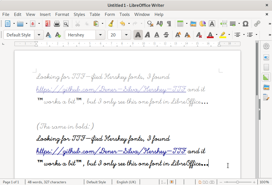
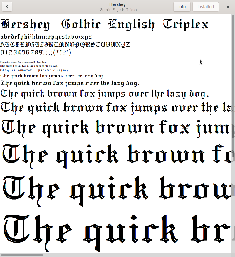
I’ve spent more time than I’d like to admit with Allen V. Hershey’s fonts. The well-meaning mod.sources Usenet Font Consortium conversion from the 1980s broke a few of the glyphs, and there’s no machine-readable version of the original NTIS data that I know of.
Curiously, Hershey’s data format is a lot closer to what we might want to use now than the mod.sources reformat. There’s some very 1980s Unix-culture-knows-best hubris in the original posting:
The font data in this distribution may be converted into any other format EXCEPT the format distributed by the U.S. NTIS (which organization holds the rights to the distribution and use of the font data in that particular format). Not that anybody would really want to use their format… each point is described in eight bytes as “xxx yyy:”, where xxx and yyy are the coordinate values as ASCII numbers.
they use no accepted typographical conventions whatsoever;
they’re stroke fonts, where modern font rendering uses filled areas. In theory, PostScript RIPs can render stroke fonts (the first version of Adobe’s Courier was a stroke font, and was hideously ugly) but they’ve been trying hard not to for decades;
they’re made up of straight line segments, so even with best-efforts rendering they’ll look juddery;
there are thousands of glyphs, all presented without description and in pretty much the order that made sense to Allen Hershey alone. Even the task of mapping that to Unicode is more than enough for one person. Then there’s the Kanji to deal with (which I didn’t).
There are lots of fonts out there that are prettier and easier to use than the Hershey fonts. It’s remarkable that millions of dollars worth of computer time were allocated to this project in the 1960s.
I think the problem is bit mapped displays have yet to have good anti-aliasing.
They fake it by coming out higher and higher screen resolution instead. Ben.
Modern displays have great font hinting, right down to sub-pixel RGB anti-aliasing. It’s just that single line fonts like the Hershey vectors can’t use hinting, as it is something that can only be applied (pretty much manually, per glyph) to a filled vector font.
I was thinking more on the graphics primtives. draw line A to B with antilaiasing
thickness small. Is there even a device independant video interface standard
out? I never liked the idea of modern GUI’s being pixel organized. There must be something better.
Actually, we’re going in the other direction. macOS, for example, has reverted from subpixel rendering to rather archaic double-size rendering and shrinking… The prospects are not the best.
I think we’ve been a bit spoiled by LCD displays - especially the earlier versions. The pixels were so distinct, we got used to seeing characters as a matrix of discrete rectangles. So when you move towards anti-aliasing, or any kind of scaling, you get some proportion of people complaining about blurry fonts. Hopefully, with later higher-resolution LCDs, we can have anti aliasing and everything looks like ink on paper.
I’ve been dreaming of this (responsive high resolution passive display, much like 300dpi e-ink) since the early 1990s. While I think that this would solve most display issues, I don’t expect to live and see it yet.
Computers seem to be television right now, with the way web browsers are going.
My complant is you can not get a 3:4 displays anymore, for older machines
like mine. Like you I wait for fast ink on paper like displays.
Do not despair, displays are becoming relatively higher again (compare the new MacBook[Air] series with 16:10 display ratio) and 4:3 displays are coming more into focus again. I guess, we will see some on the market in reasonable time.
Vector fonts have always been one of my favorite things. Always nice when you can zoom in and see those nice crisp lines.
I bought a Dell UltraSharp U2412M, it’s 16x10 so it’s taller than a typical screen for the width and it has 4x3 and 5x4 modes and VGA input so it’s great for older computers. Text mode DOS also looks better on a wide display.
Looks like there are some rendered samples of GIMMS text in
Waugh, Thomas C., and D. R. F. Taylor. “GIMMS/An Example of an Operational System for Computer Cartography.” Cartographica: The International Journal for Geographic Information and Geovisualization 13.2 (1976): 158-166.
I’ll try to have a look at this.
(Sadly, sci-hub is blocked, where I live, and even https-encrypted DNS doesn’t help. Meaning, there must be some IP-based packet filtering involved. Which is actually a rare event. Surely, there’s nothing more evil in the world than publicly funded research papers from the 1970s becoming exposed…)
Finding papers are not the problem, haveing the source code or printed listings lost that go with the papers over the years is the problem. Look at mess with Edinburgh IMP. The hardware (ignoring vacum tube computers) can often still be found or emulated but sadly you have no software legal or other wise. A Little Implementation Language
is good example. In 1978 you could play with it, but not today. software was never designed to be portable.
Court proceedings are a great source in the very special niche of early games. Thanks to multiple lawsuites regarding Bally, Magnavox, Sega, etc, where about everybody appeared at least once as an expert witness and left some source codes as a witness deposit.